Old UI
Design a seasonal system that ties daily play to long-term episodic rewards. Make progression clear. Reduce friction between quests and tasks. Create a loop that players could understand and trust every season.
PLAYERS
Players needed one place to understand the season. A track that showed where they were, what they’d earned, and what was coming next without jumping between screens.
BUSINESS
The business needed a reliable monthly cadence. Something Live Ops could plan around. A structure that made content scheduling and monetization predictable instead of reactive.
UX
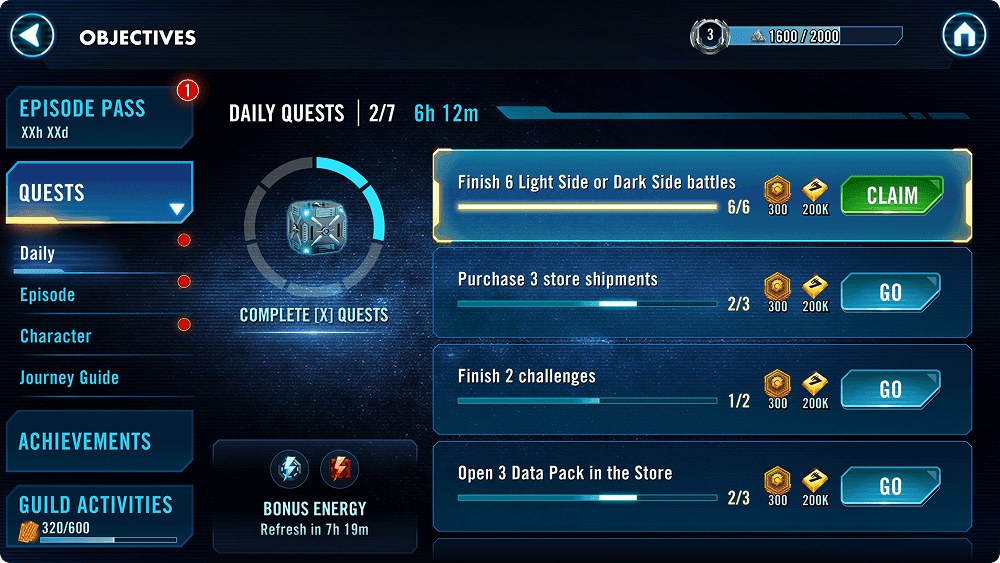
For UX, the system had to feel seamless. Play feeds progress. Progress unlocks rewards. No conflicting rules between Quests and Tasks. No cognitive overhead just to understand how you’re doing.
Audience & Player Insights:
Galaxy of Heroes players are long-term optimizers. They log in daily, tune their squads, chase limited-time objectives, and collect incremental rewards. That behavior only works when progress is visible. In the existing system, that feedback was split across multiple screens.
That gap drove the foundation of Episode Pass. Players needed one place where daily effort stacked up and clearly rolled into seasonal progression.
Player Actions
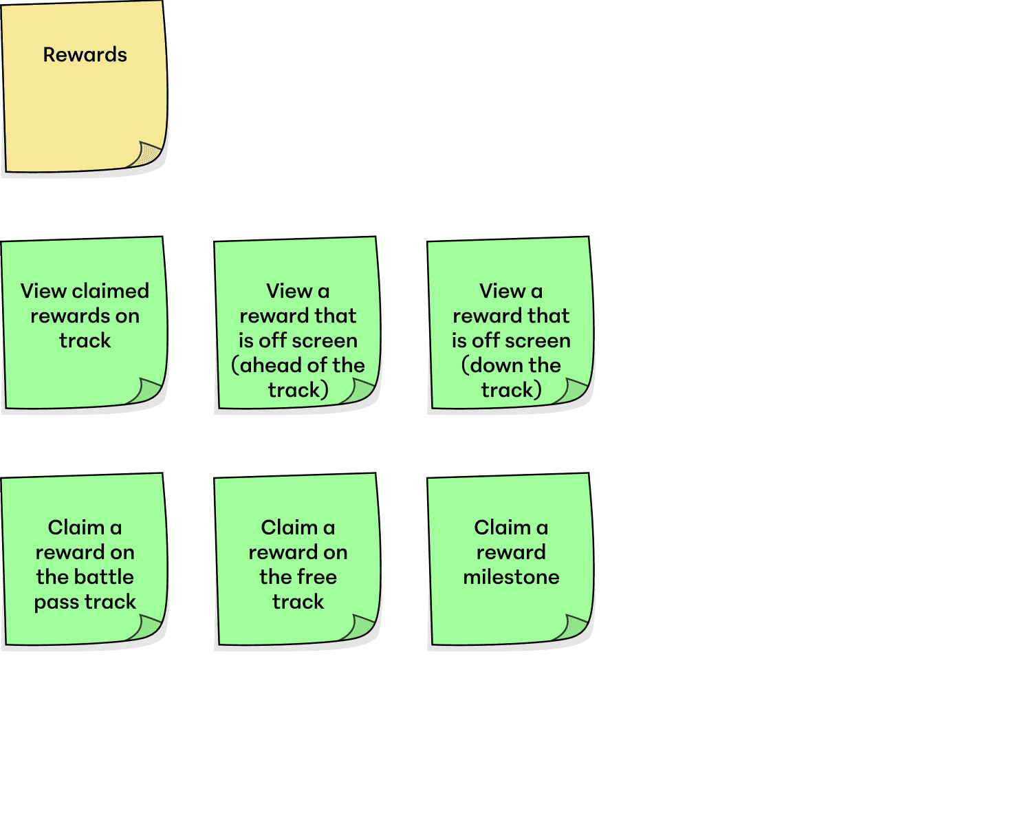
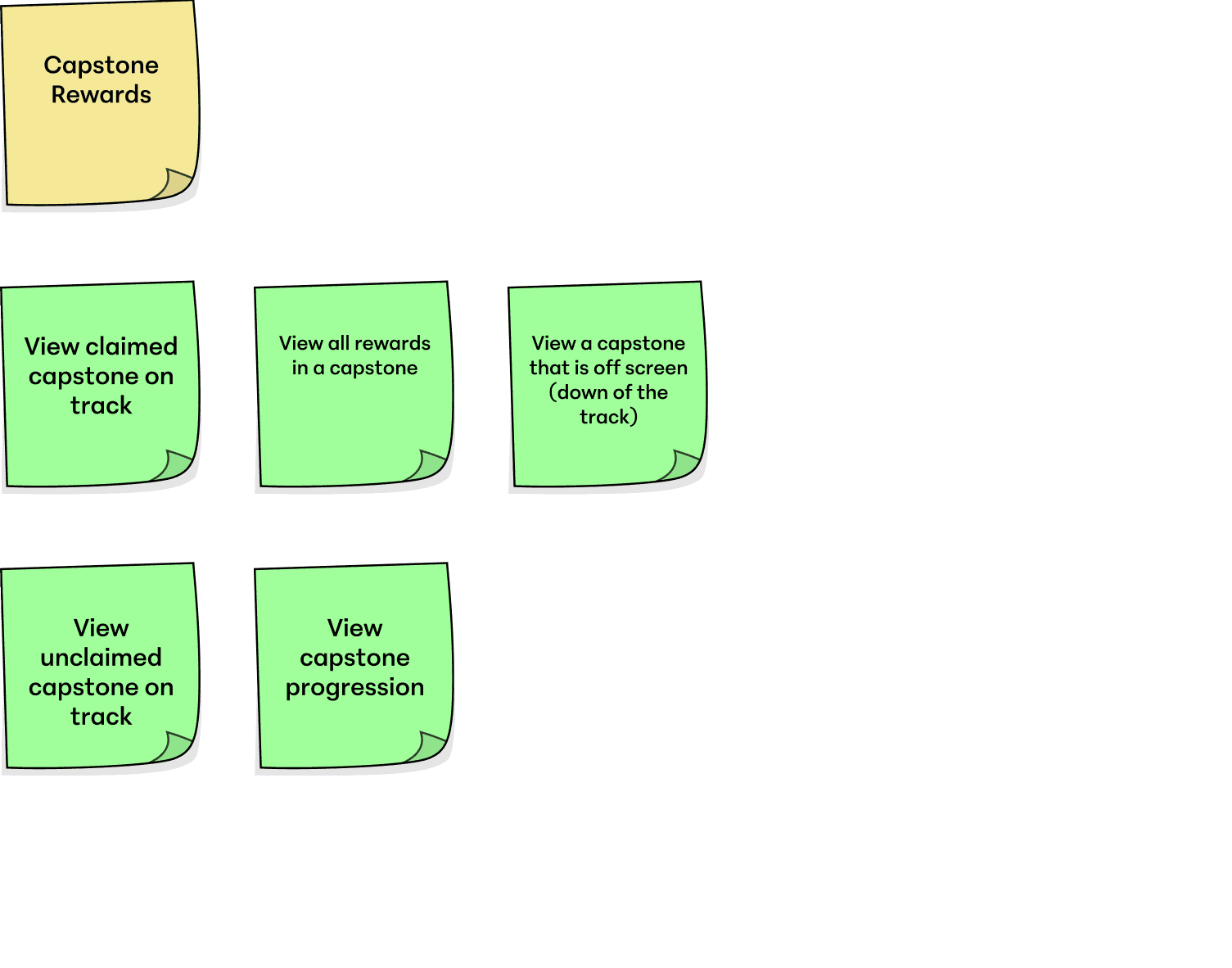
I start by breaking down player actions into the concrete interactions a system allows.
As an example, for Episode Pass I mapped how players earned, claimed, and viewed rewards along the track.
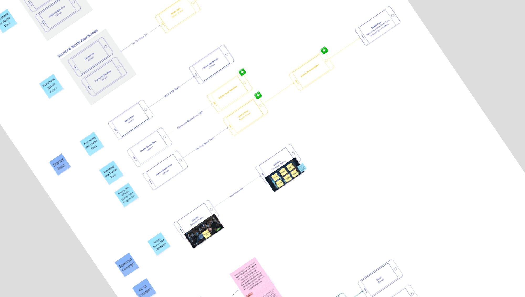
Player Paths
I created player paths based on the verbs defined in the previous step, moving from claiming rewards and previewing locked tiers to upgrading into the premium track.
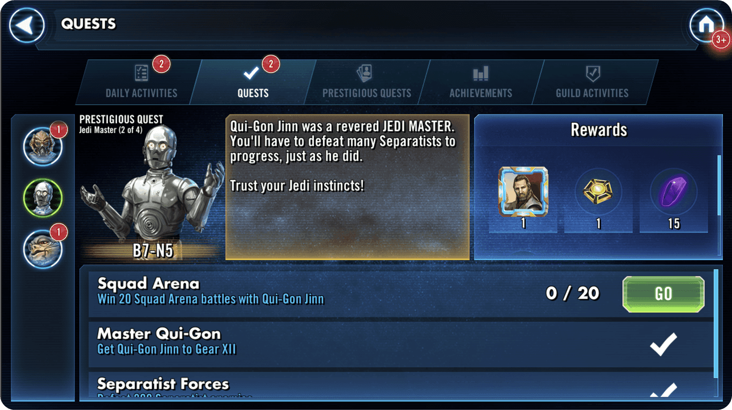
Those paths clarified how Quests fed into Episode Pass, so the two systems functioned as one seasonal loop instead of separate features competing for attention.
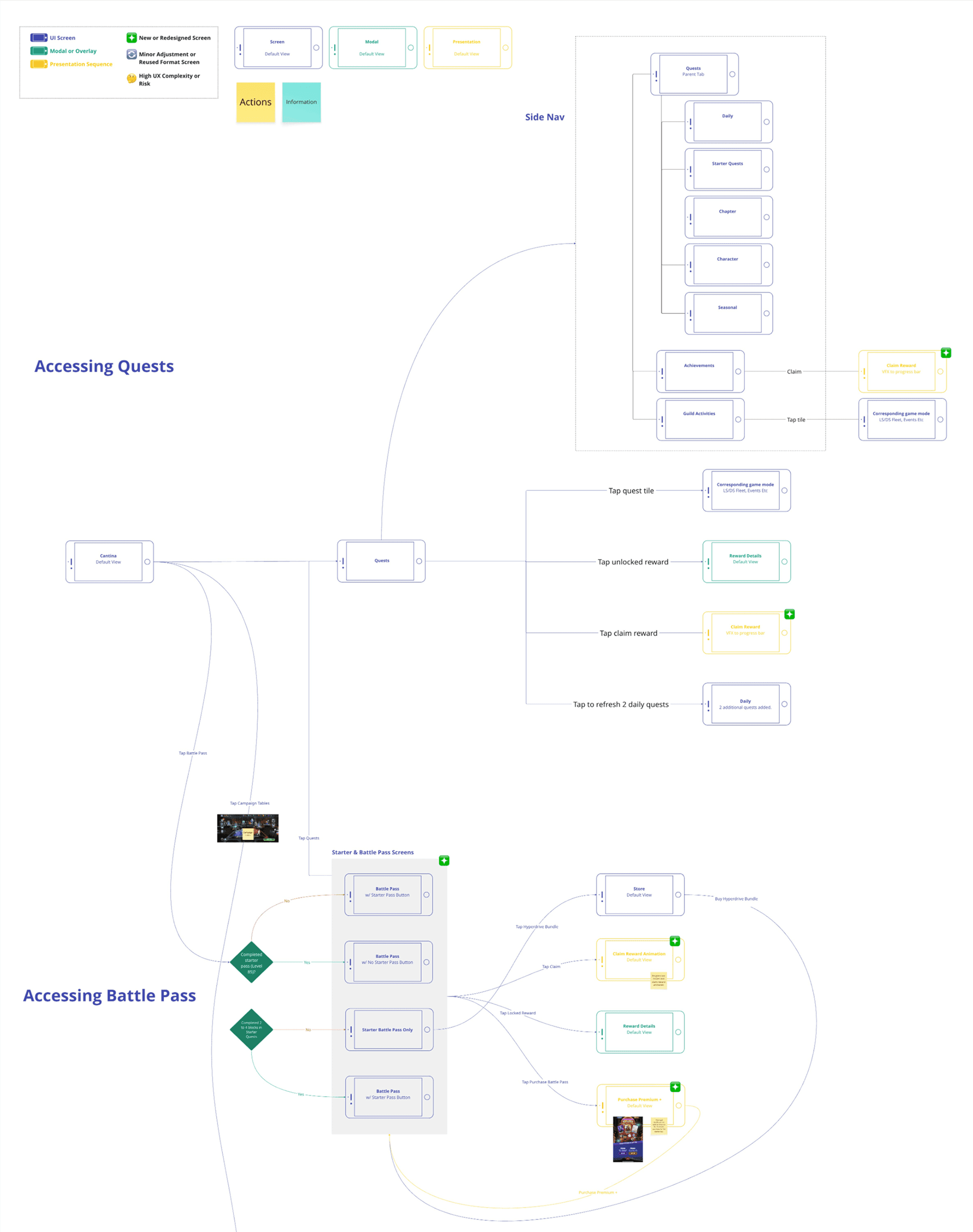
Information Architecture
Episode Pass was built alongside the new Quest system, owned by another UX designer. We aligned structure, terminology, and navigation early so the two features operated as one seasonal system.
The IA map anchored that work. It defined how players moved between Quests, Daily Tasks, and Episode Pass, and showed how the global sidebar supported consistent navigation across the experience. It also captured early explorations of the Starter Pass, which later evolved into the Free track.
Cross-Team Collaboration
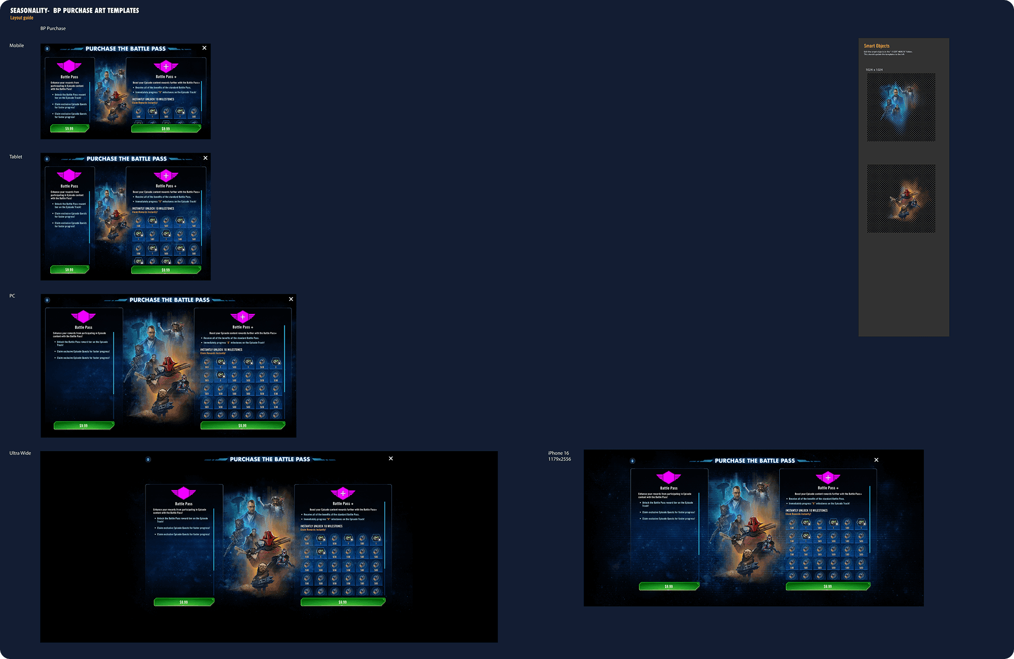
I partnered with the Art Lead to build a shared Photoshop template for Episode Pass purchase screens. Smart objects let us swap character art quickly while maintaining a consistent layout across mobile, tablet, and PC.
This reduced visual drift, sped up iteration, and gave Live Ops a scalable purchase framework that didn’t need to be redesigned every season.
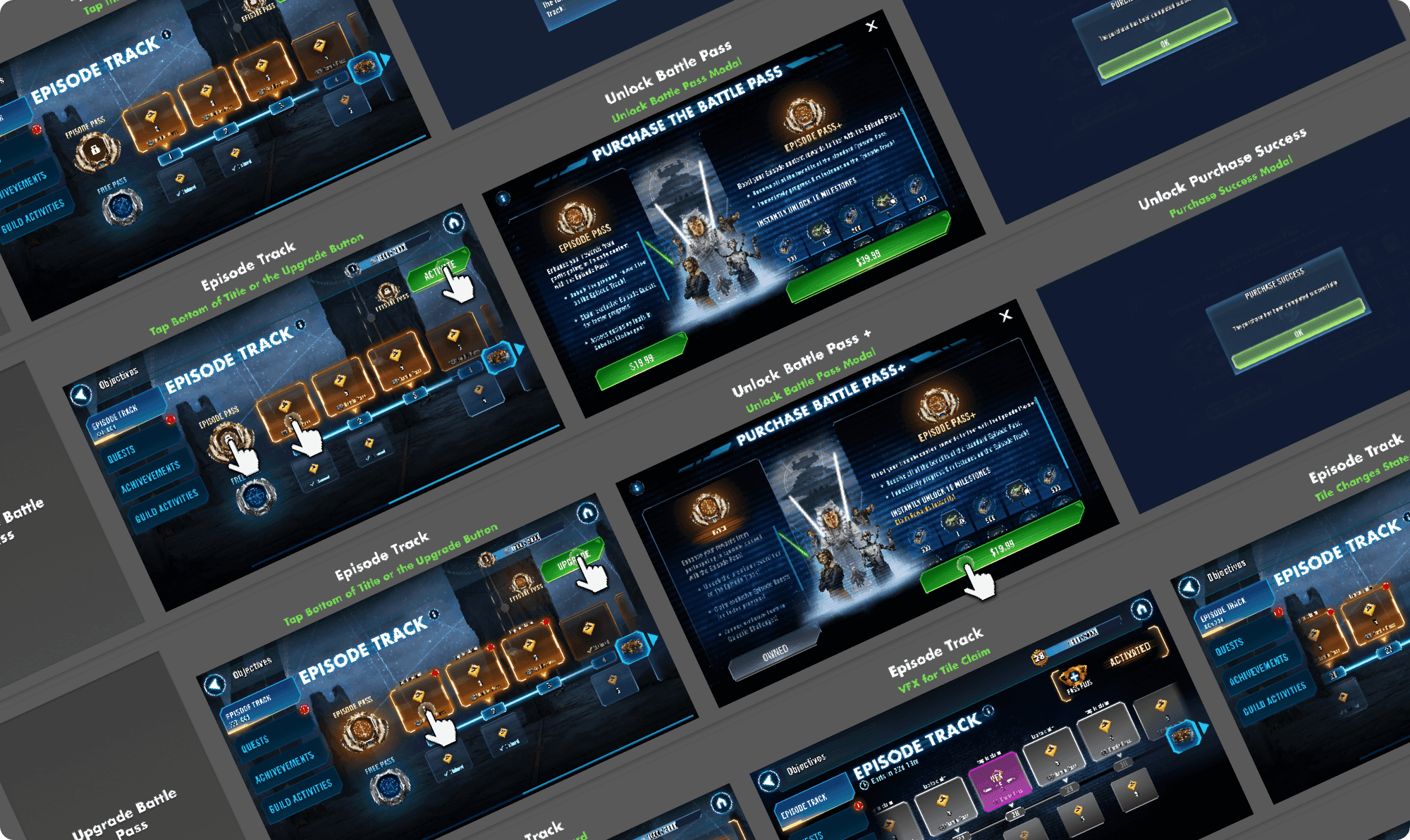
Wireframes
I designed high-fidelity wireframes covering the Episode Pass journey, from first entry through purchase and reward claiming. Each screen prioritized clarity and momentum so players always understood their current state and next action.
These wireframes guided engineering implementation and cross-team reviews, aligning UX, art, and Live Ops around a consistent seasonal structure.
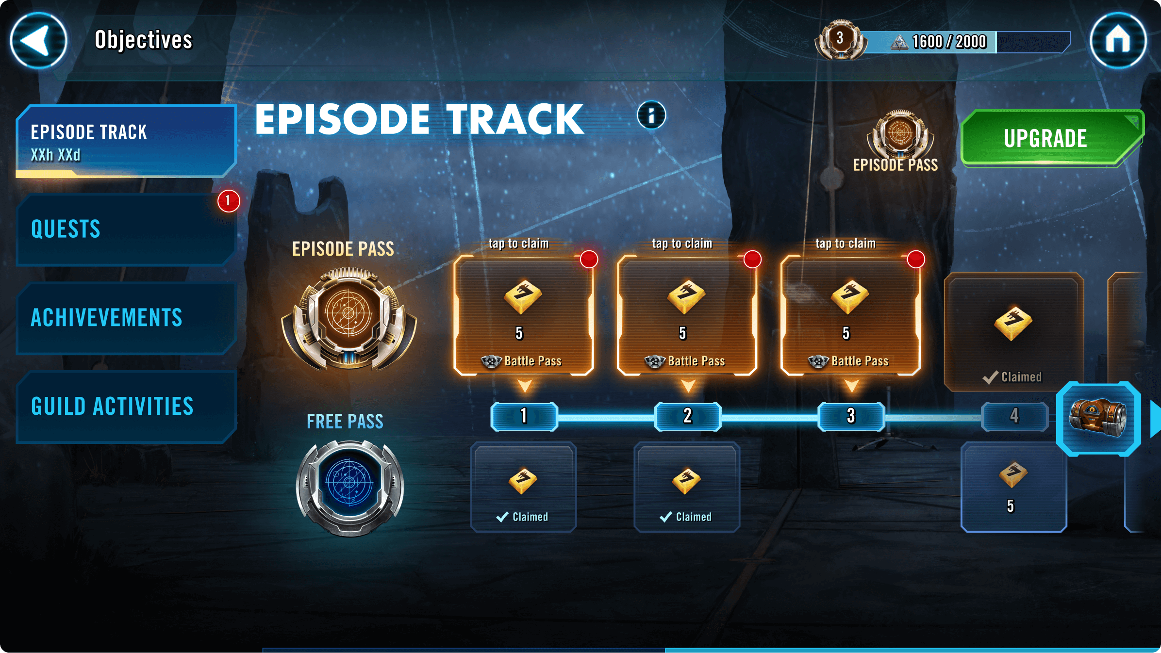
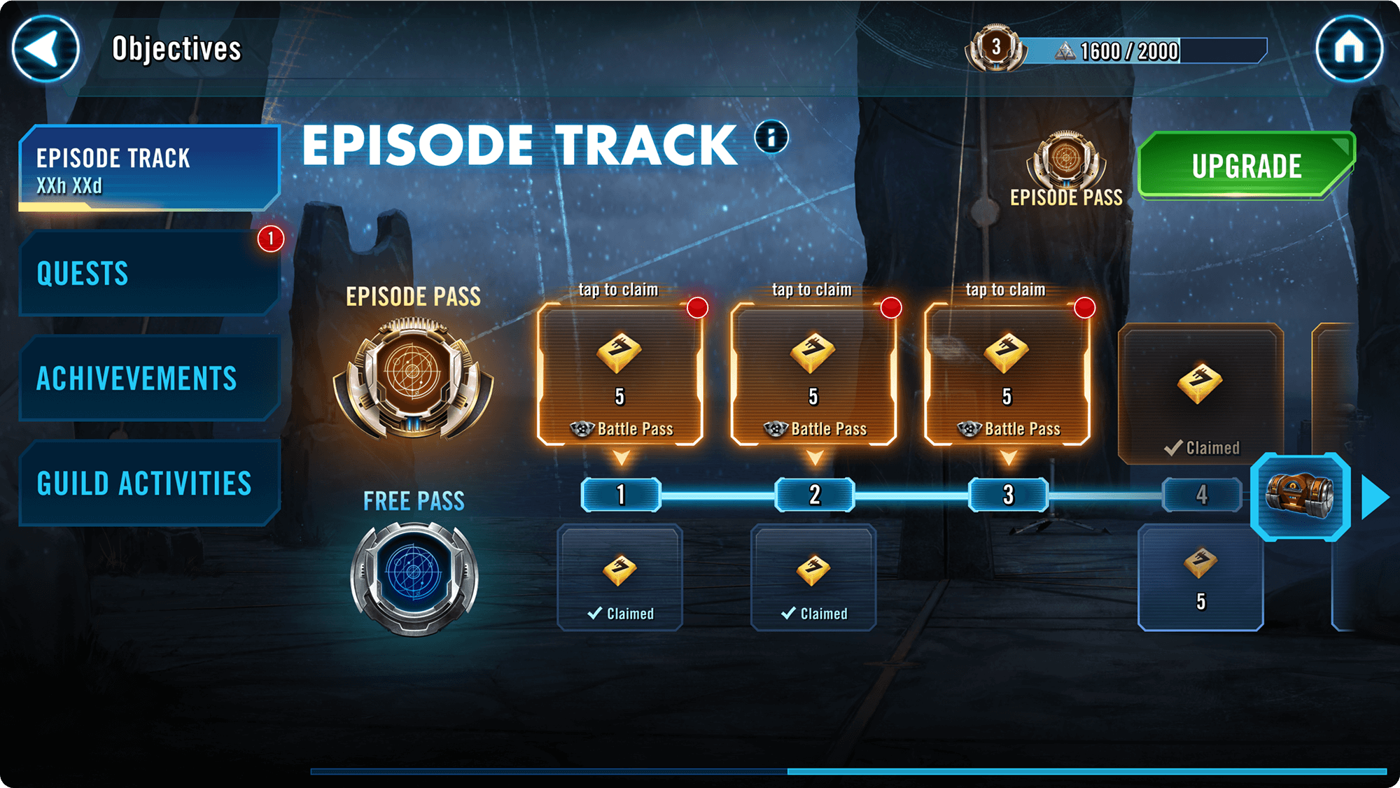
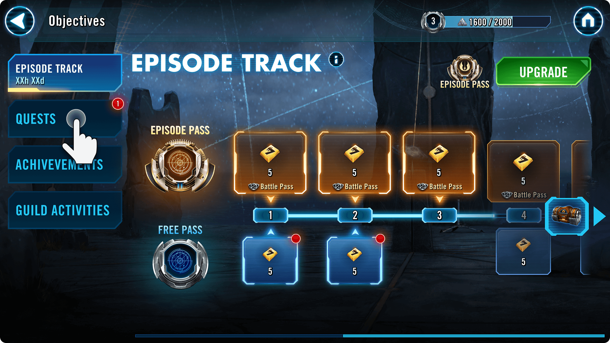
Episode Pass created a single, predictable seasonal loop. Daily play, quests, rewards, and monetization now live in one system instead of competing across separate screens.
Free and Premium tracks share the same structure, so progression is easy to follow and upgrades feel natural. Players can see where they are, what they’ve earned, and what comes next.
Clarity and Progression Visibility
Free and Premium paths run in parallel with identical layouts and states. This removes guesswork and makes the upgrade value clear without forcing players to relearn the system.
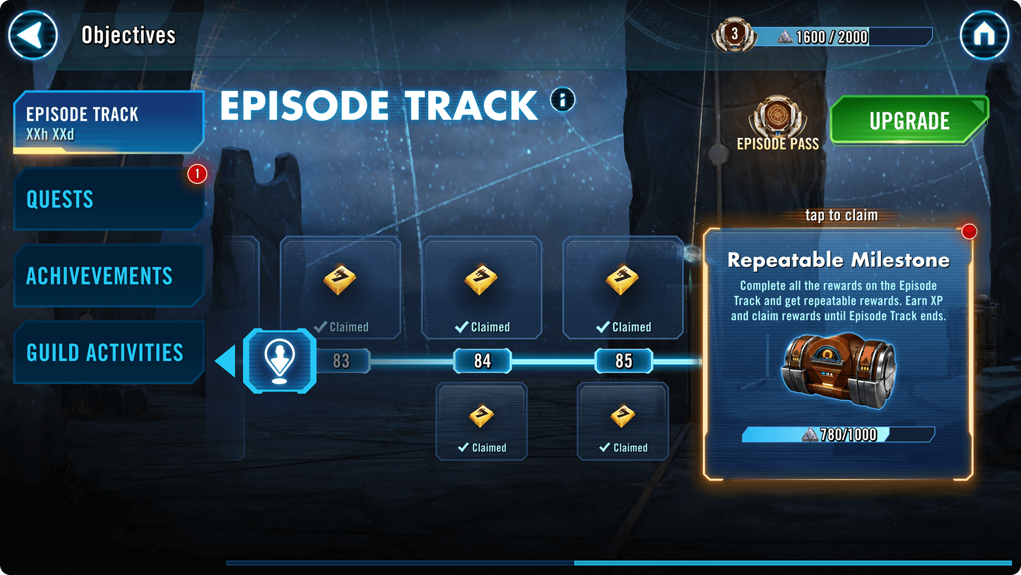
Motivating Pacing and Feedback
Progress unfolds in steady, readable beats. Clear claim states, milestone moments, and repeatable endpoints reinforce momentum, whether players log in briefly or invest deeply.
Transparent Upgrade Path
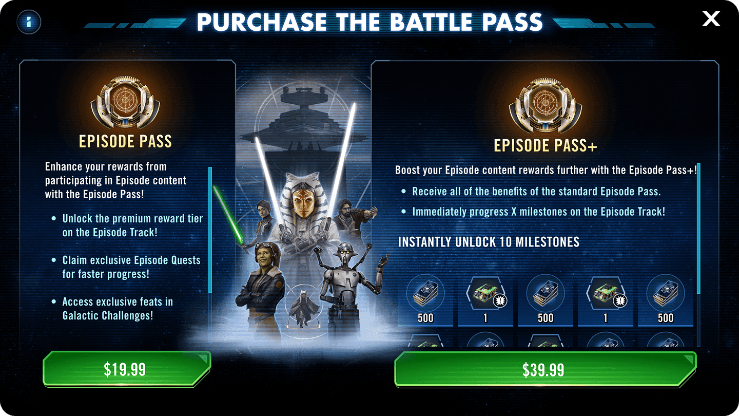
The purchase screen presents Episode Pass options side by side so players can quickly compare value. Premium and Premium+ clearly show immediate rewards and milestone skips, supporting confident purchase decisions.

Shared System, Shared Language
Core components such as side navigation and the persistent progress bar are reused across Episode Pass and Quests. That consistency reduces friction and reinforces the season as one connected loop.
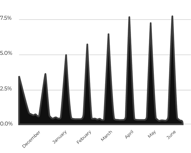
Each Episode launch produced a clear conversion spike, starting in December 2024. Conversion peaked around seven percent at release before returning to baseline between Episodes.
The pattern was consistent. Players upgraded in response to new content drops, not gradual accumulation. Strong launch visibility and clear reward framing drove performance.
Episode Pass gave Live Ops a repeatable monthly conversion moment and players a clear reason to engage at the start of each season.
Episode Pass Conversion Dec ‘24 - June ‘25
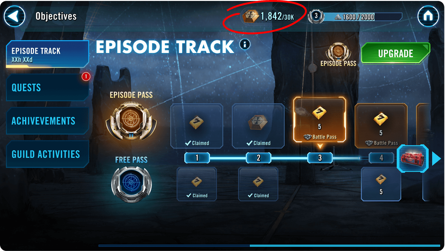
Players often hit credit cap warnings when claiming rewards. The problem wasn’t messaging. It was timing.
By surfacing the Episode Credit Bank in the header, players could see their limits before claiming. The change removed confusion and made the reward loop feel intentional instead of catching players off guard.
Initial Experience
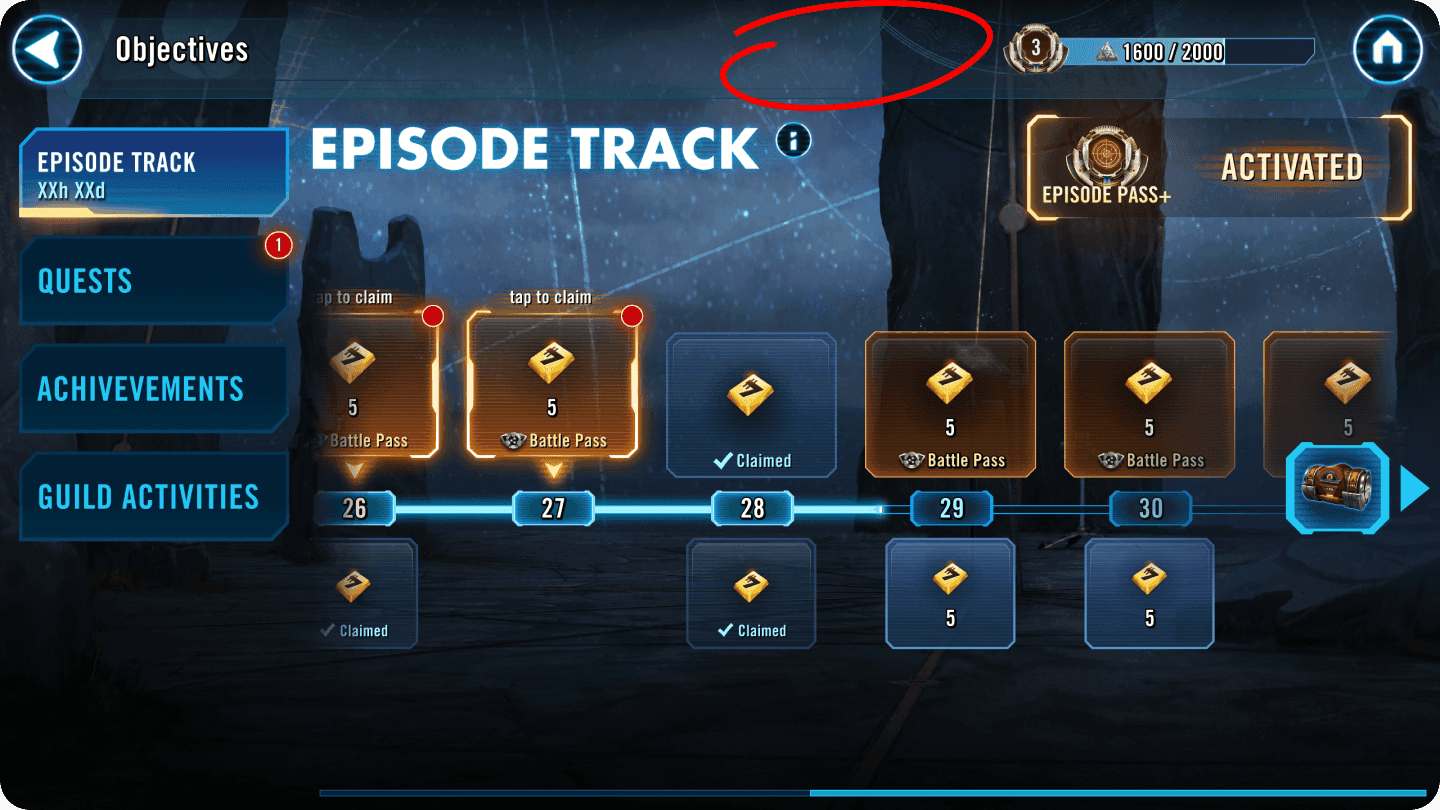
Refined Experience
Building Episode Pass reinforced the value of a connected system. By aligning quests, daily actions, and seasonal rewards into one loop, progression became clearer and easier to sustain over time.
For the studio, it created a repeatable seasonal framework that improved alignment, supported Live Ops planning, and scaled as new Episodes shipped.