PLAYERS
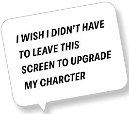
Players needed a path they could understand instantly: jump in, battle, upgrade, replay. No dead ends. No leaving the event just to make progress.
BUSINESS
From a business perspective, the goal was to increase tier completion, improve replay rates, and support the upgrade/purchase loop by surfacing value at the right moments without interrupting flow.
UX
My role was to design a clear loop and a scalable structure for battling, progressing, and upgrading inside the event.
The goal was to restore clarity to the Marquee flow and improve character bundle performance. I based the redesign on player behavior, focusing on the moments that confused, slowed progress, or pushed players out of the loop.
I pulled signals from player feedback, a UX teardown, competitive analysis, and early alignment with PMs, design, and engineering. From there, I reframed the event and partnered with art to create a character implementation workflow that scaled for future releases.
Research:
Player feedback, internal discussions, years of hands-on experience, a UX teardown, and competitive analysis pointed a number of breakdowns.
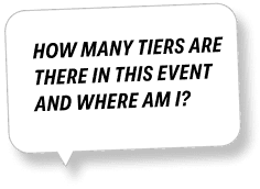
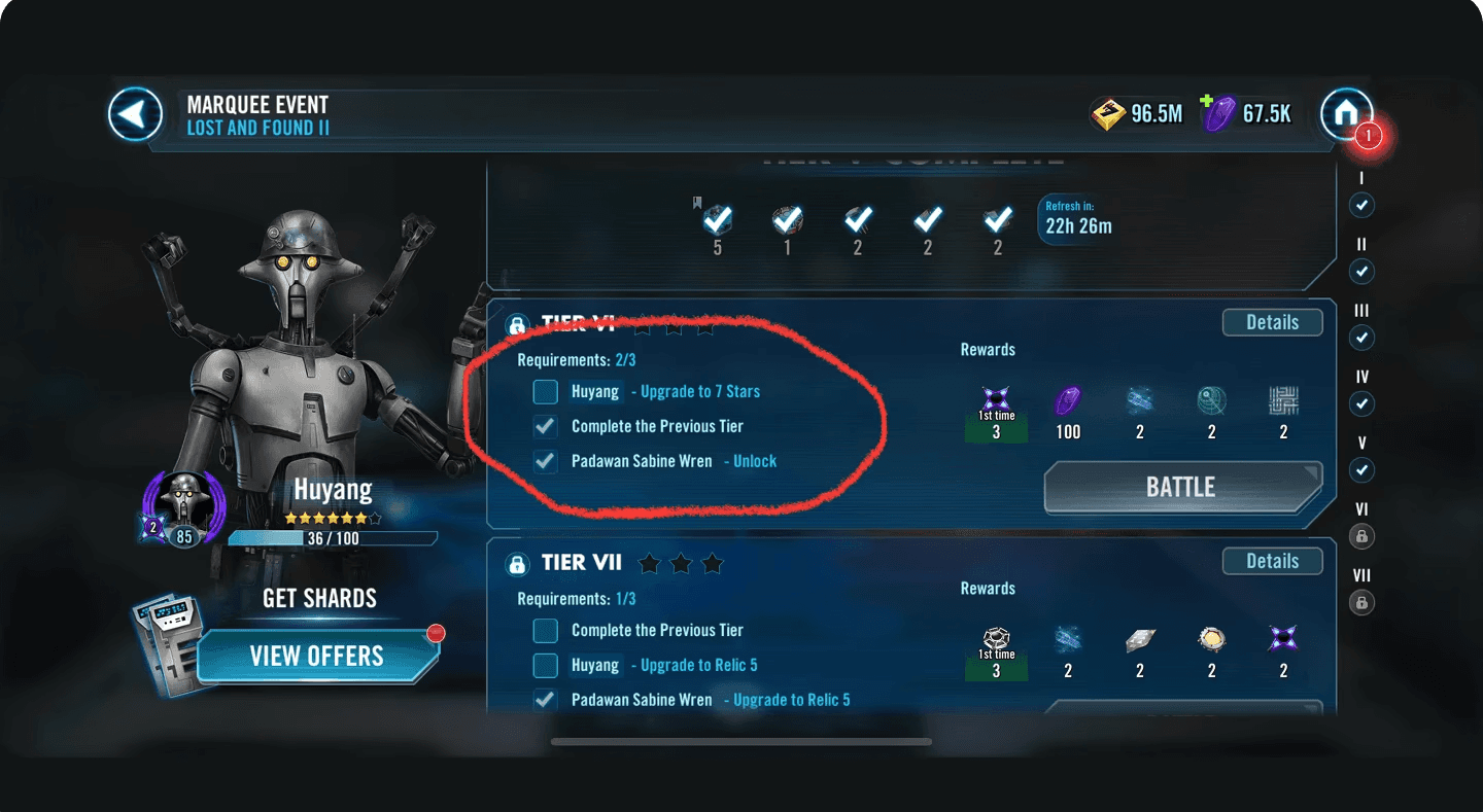
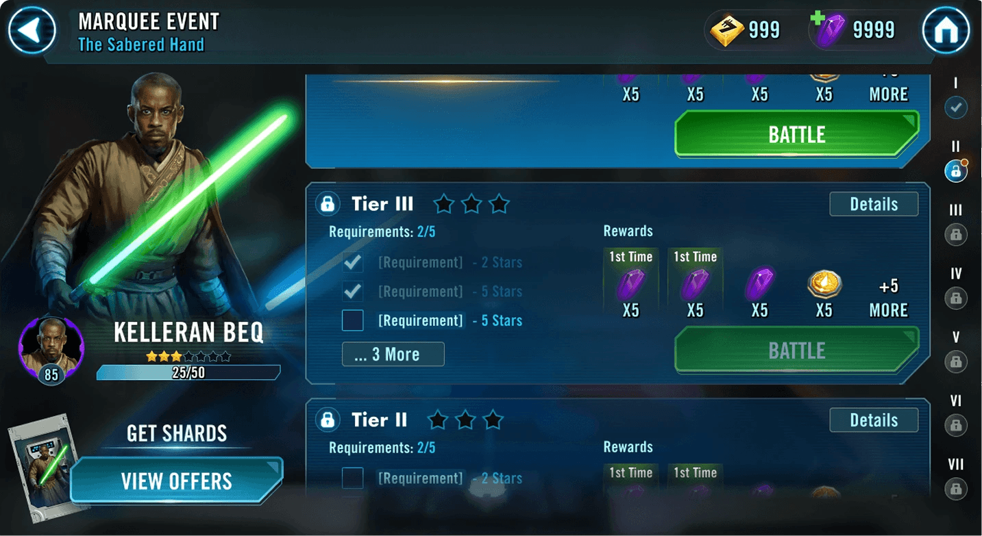
Rewards and requirements lived on separate screens, and tier states and rewards were hard to parse, making progress unclear. The UI offered no clear representation of the required character, and upgrading or promoting meant leaving the event. Players also couldn’t access the store from within the flow, interrupting the loop when motivation was highest.
Audience:
Casual players needed direction. Core players wanted predictable value. Lapsed players needed a clear way back into the loop. The redesign put clarity first, surfacing value early and giving every player a reliable next step.
Define:
In pre-production, I mapped the core actions players take during a Marquee event.
Three anchors shaped the redesign: character investment, clear rewards, and progress tracking. Investment drives long-term engagement. Clear rewards reinforce value. Progress tracking helps players understand where they are and what unlocks next.
These principles became the foundation for the redesigned Marquee UI.
Player Actions
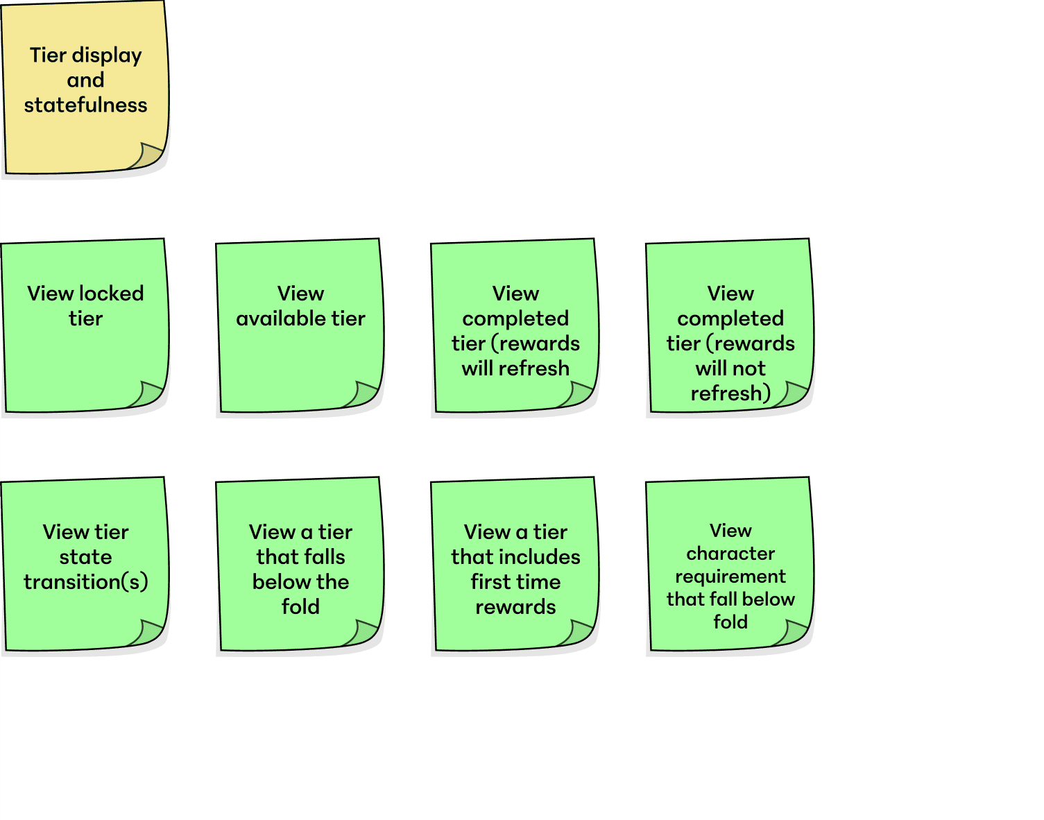
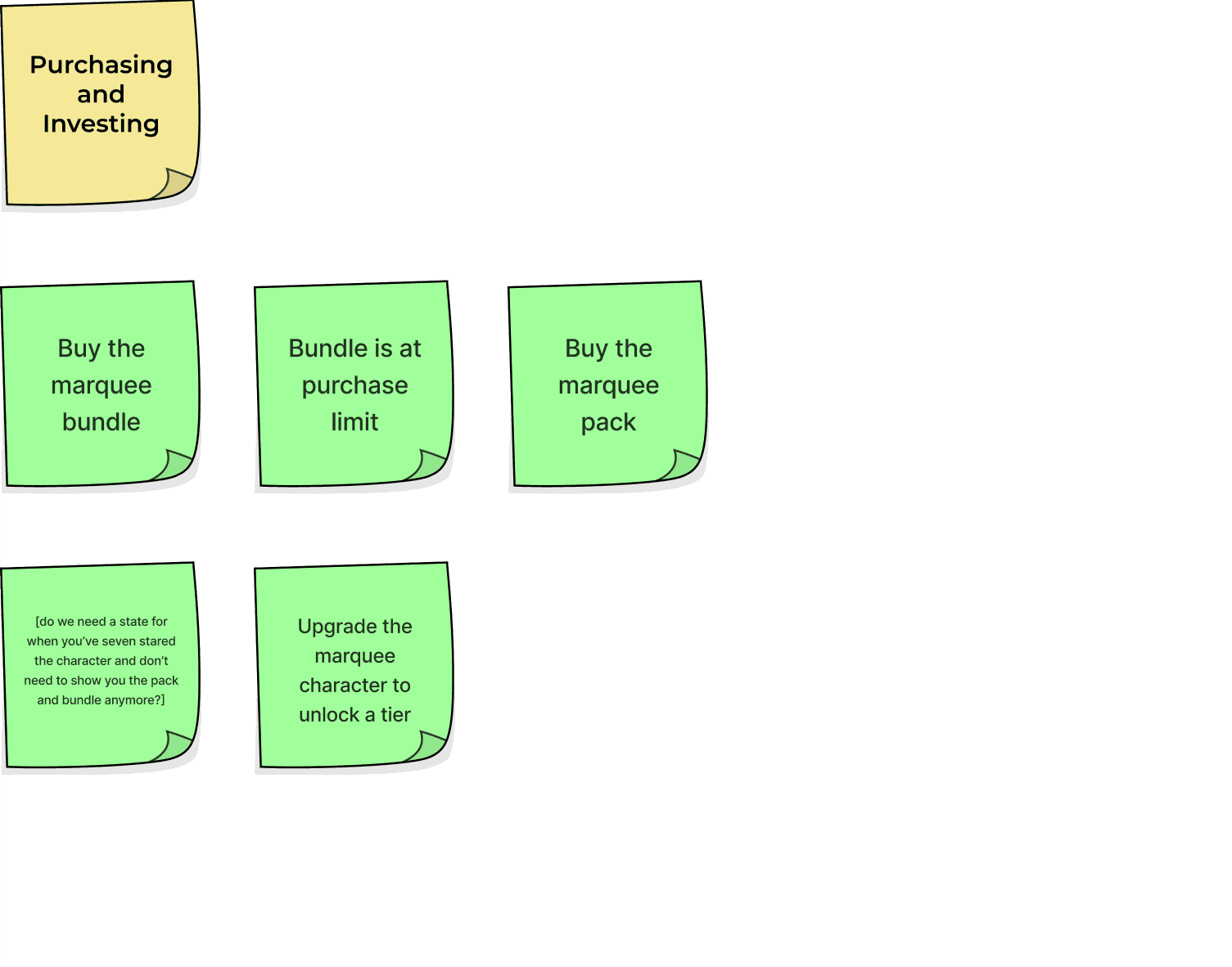
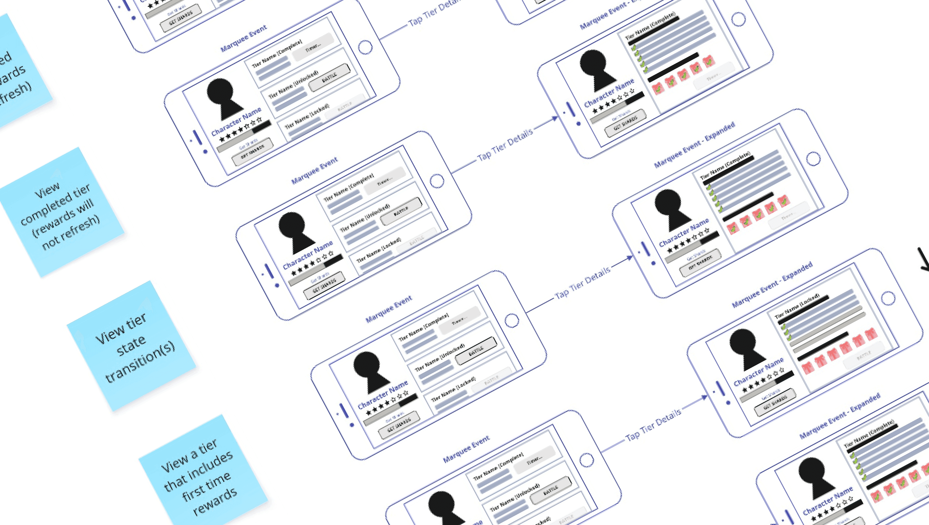
The sticky diagrams below show examples of how I break actions into clear, interactive states. Before designing screens, I mapped how tiers appear, how rewards refresh, what happens when a purchase limit is reached, and how upgrade requirements gate progression.
That process exposed edge cases early. How should a completed tier look when rewards don’t refresh? Are requirements discoverable if they sit below the fold? Should bundles still appear once a character hits a star cap?
Working through those questions upfront clarified the logic before UI came into play. It kept the Marquee flow predictable and prevented the kind of dead ends players had been running into.
Ideate:
Player Paths
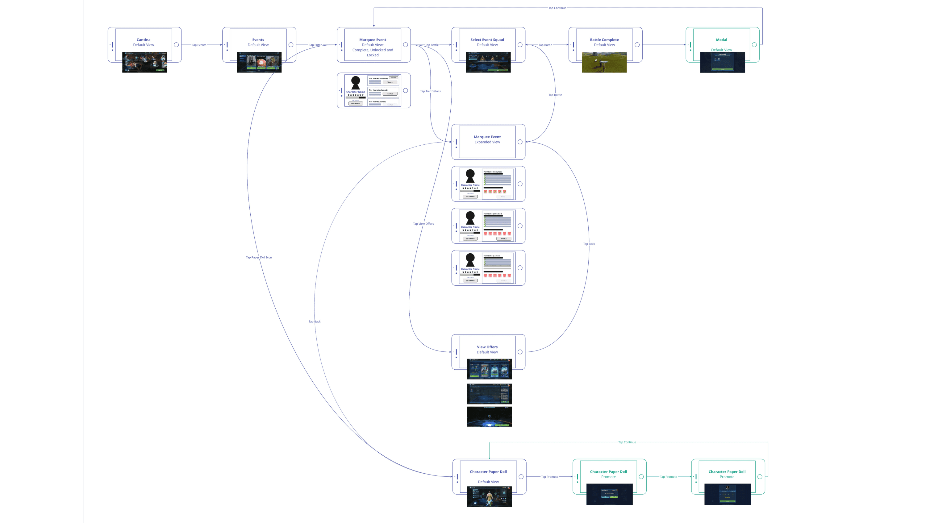
I mapped the full player journey across the Marquee Event, from discovering the unit to checking requirements, upgrading, investing, and battling through each tier. This structure defined the wireframes and established a clear system for the Figma build.
Information Architecture
The IA centered the experience around the Marquee hub, defining a clear path from entry to exit. Players could branch into battle, upgrade, or “Get Offers” and return without leaving the event.
This removed unnecessary exits and established a predictable loop that informed the new player paths and wireframes.
Design:
Wireframes
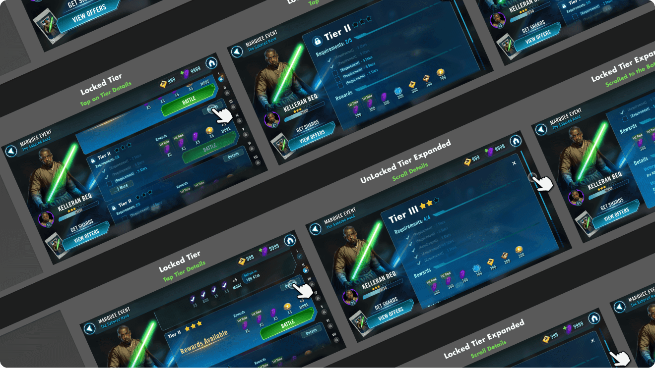
I designed high-fidelity wireframes covering the full Marquee loop, from entry to reward collection. These screens guided implementation and kept design, art, and engineering aligned through development.
Prototype
I built a working Figma prototype that demonstrated the Marquee experience end-to-end. It aligned the team around the new flow, served as the reference for engineering, and I used it to present the feature during a weekly studio-wide meeting.
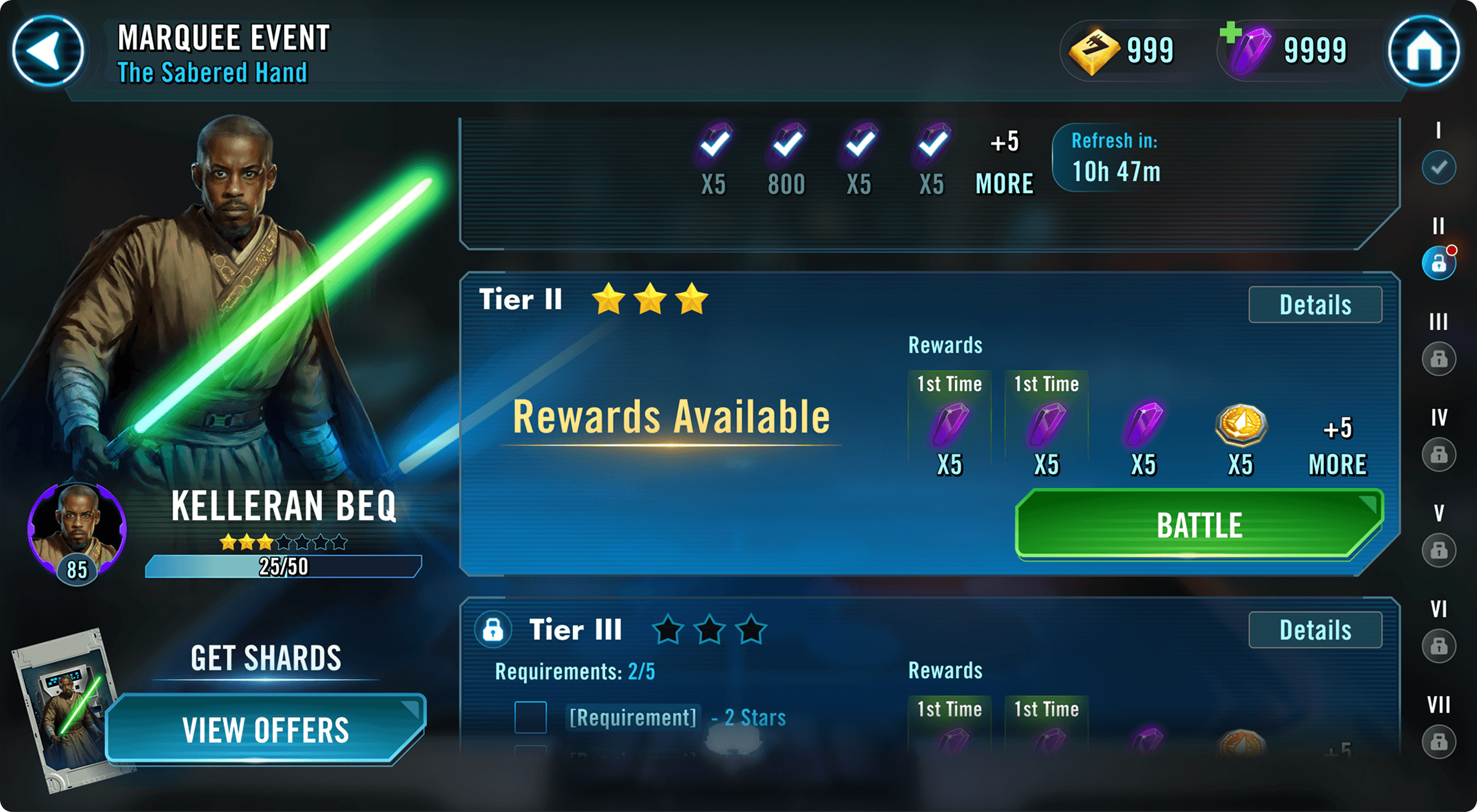
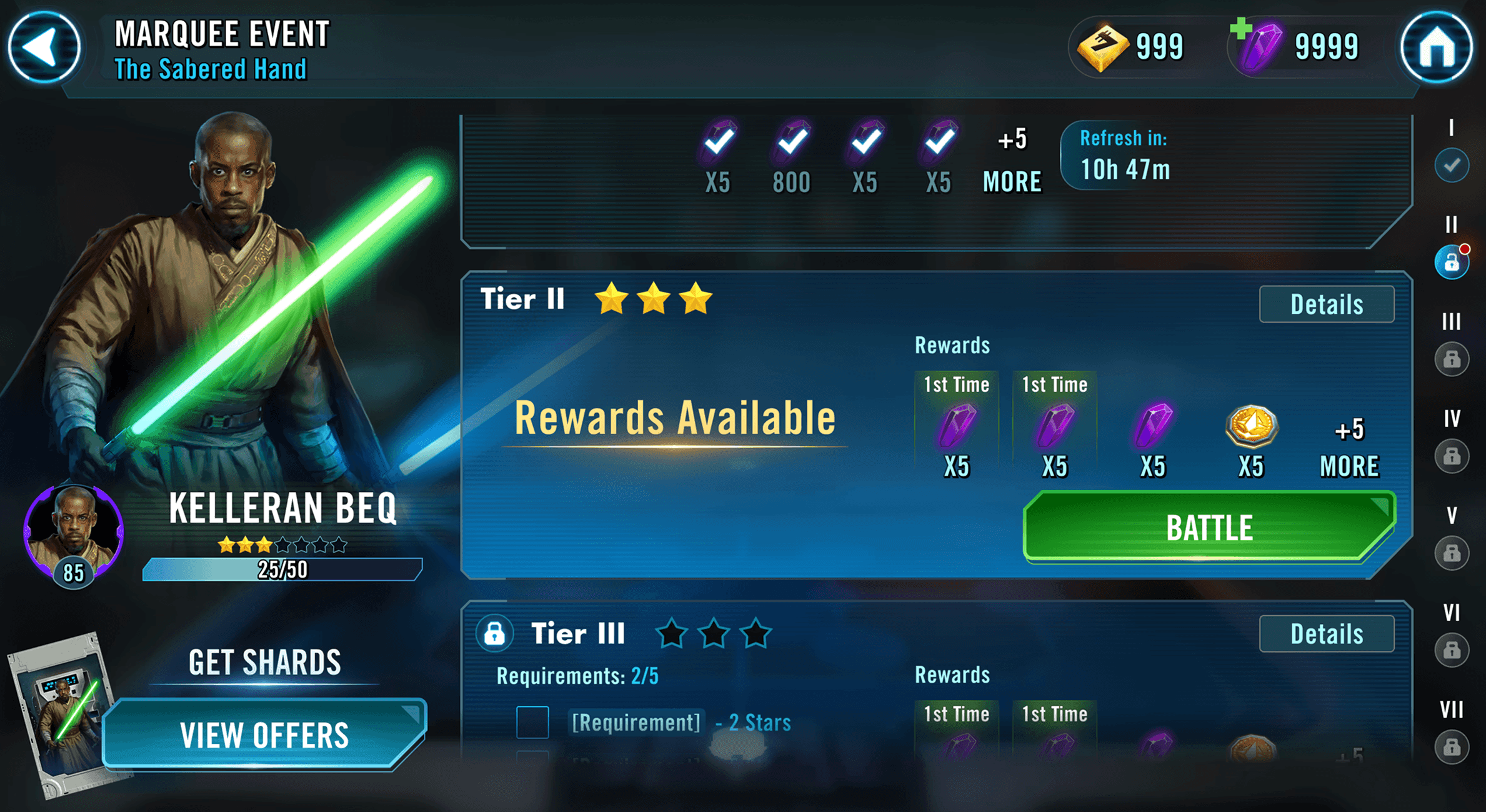
I rebuilt the Marquee event system as a single, cohesive flow where players never lose context. Character representation sits directly in the event UI, with clear, high-contrast elements that make progress and requirements obvious at a glance. Unlocking, upgrading, and promoting happen in one place. Rewards surface early, tier states are unmistakable, and store access is integrated into the loop so players can purchase at the moment motivation is highest.
Players can move from battle to upgrade to purchase without losing context.
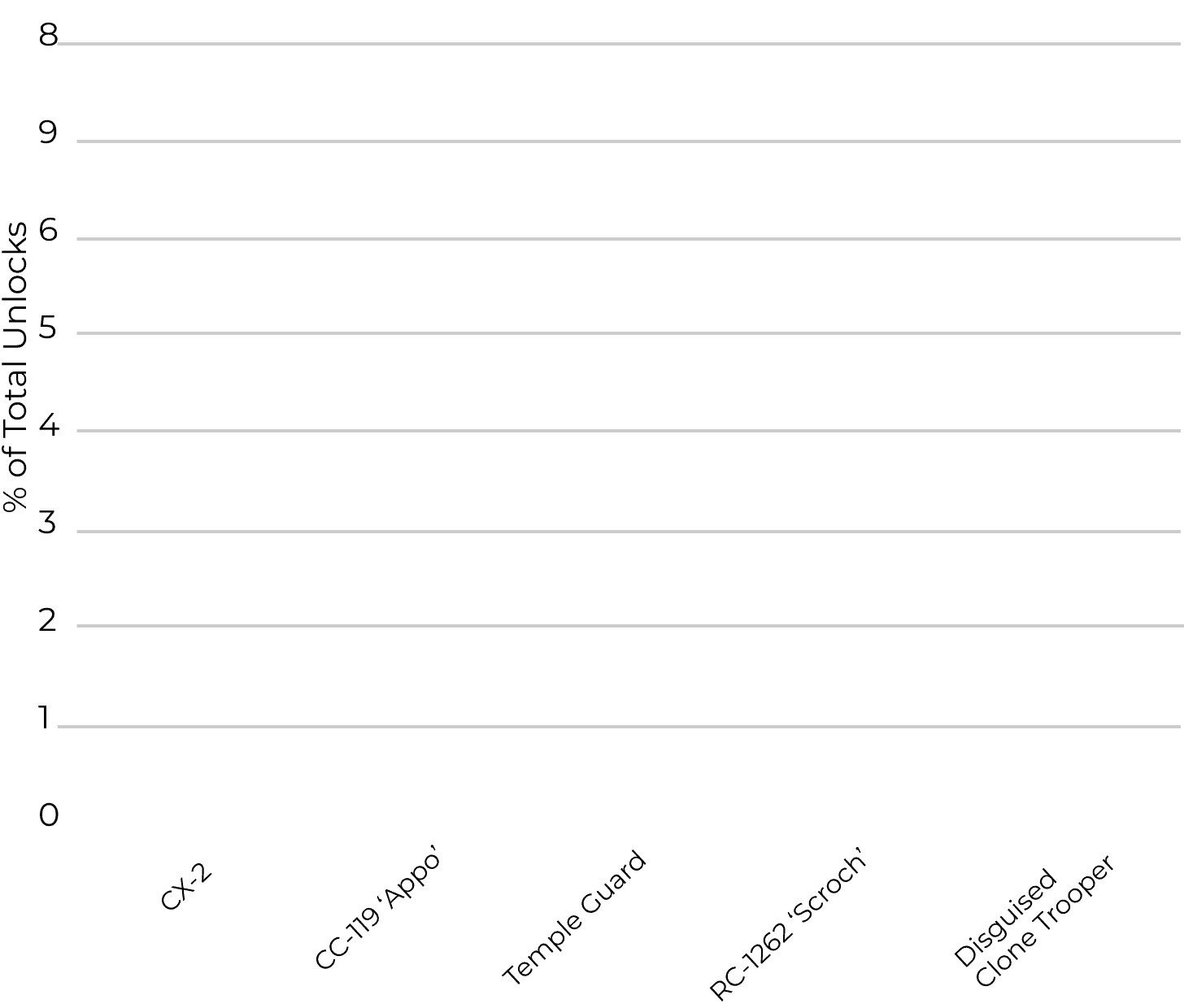
Characters tied to the redesigned Marquee experience ranked among the top unlocks within the first week, with CX-2 leading overall 5★ + unlock share.
Players invested earlier and pushed these units to higher star levels faster than expected. The updated flow kept players inside the event, driving stronger first-week upgrades and completion.
Top Characters by 5 Stars + Unlock Share (First 7 Days)
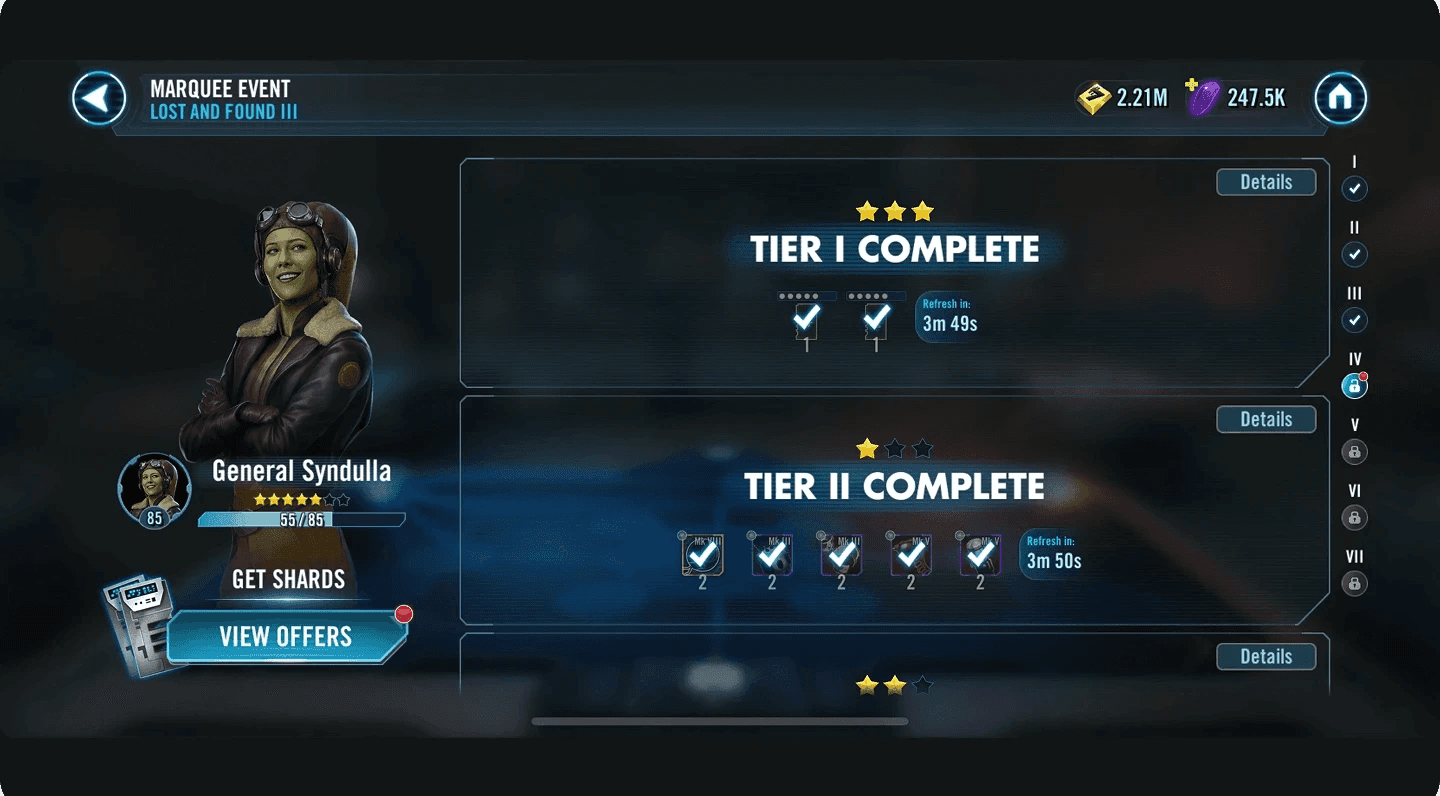
After launch, we continued refining the experience based on player behavior and real usage. We increased contrast and clarified tier states so progress and requirements were easier to read at a glance.
Initial Experience
Refined Experience
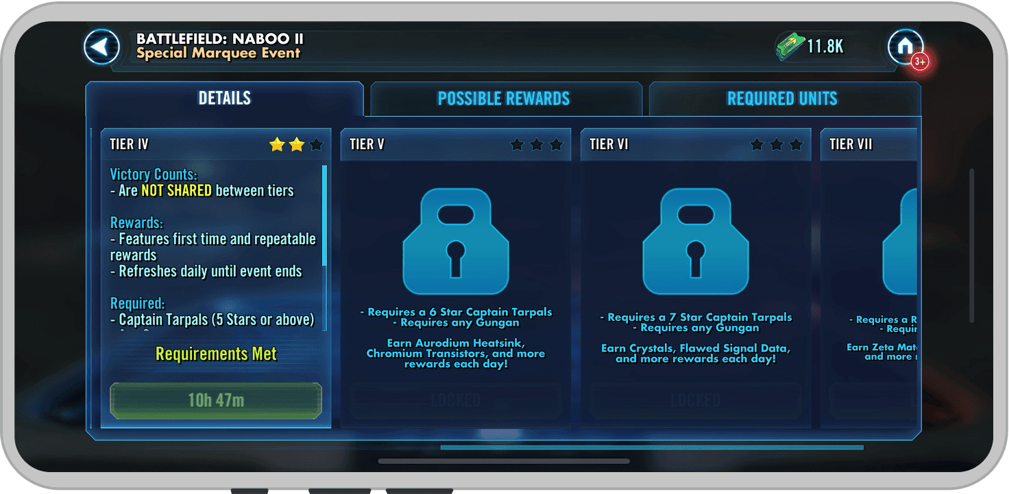
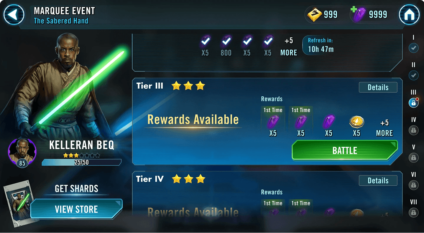
We also addressed momentum breaks when players returned to the event. The experience now auto-centers on the next actionable tier, keeping players in flow instead of forcing them to scroll and reorient.
Initial Experience
Refined Experience
This project reinforced that clarity drives growth. When players can see progress, understand their options, and act without friction, momentum follows. By aligning character investment, progression, and rewards into one readable loop, Marquee shifted from a fragmented system to a predictable, scalable experience.
The takeaway was practical: start with player intent, define the system before the screens, and treat clarity as a feature. Clarity removes drag from the system.
