
Audience & Player Insights
Tooling & Workflow
To support the scale of the product, I transitioned the team from Adobe XD to Figma. It gave us a shared source of truth across design and engineering, improved collaboration, prototypes and enabled a component-driven system that could support Infinite and legacy titles.
Information Architecture
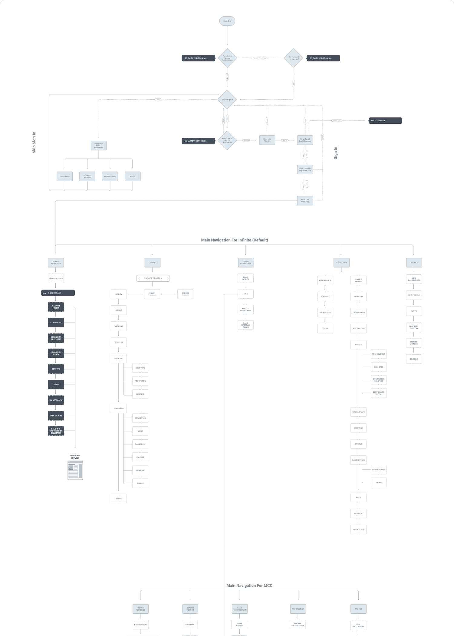
I rebuilt Waypoint’s IA around a single, predictable navigation model that worked across Infinite and legacy titles. Flows were mapped from onboarding through deeper areas like Service Records, customization, and match history.
Tightening the hierarchy and removing unnecessary screens reduced clutter, making it feel natural to move between titles on mobile.
Persistent Navigation System
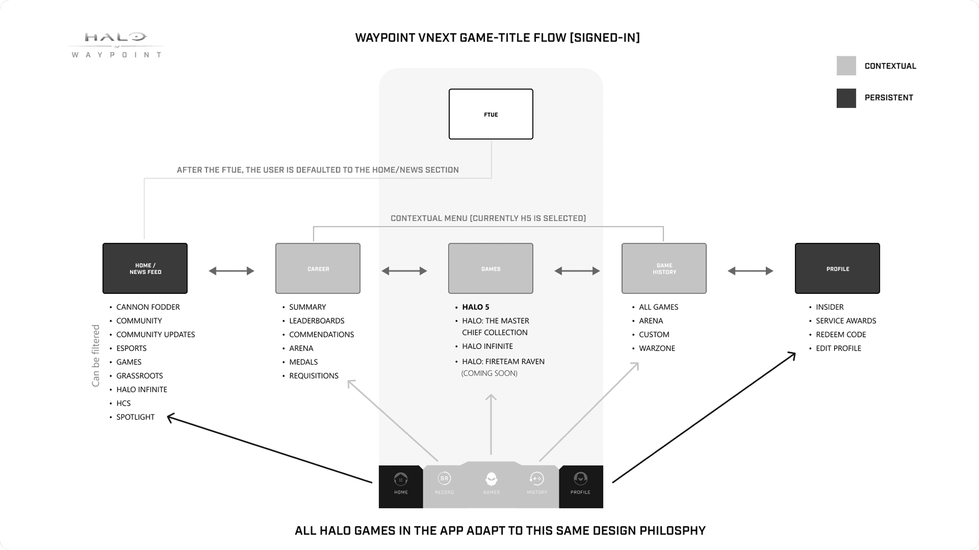
I introduced a consistent bottom navigation model anchored by Home, Career, Game History, Customization, and Profile. It replaced title-specific menus with a shared structure across Infinite, Halo 5, MCC, and future releases.
While the navigation stayed fixed, visual theming adapted to the active game. Each title kept its identity without altering the underlying UX, so players could move between games without relearning the app.
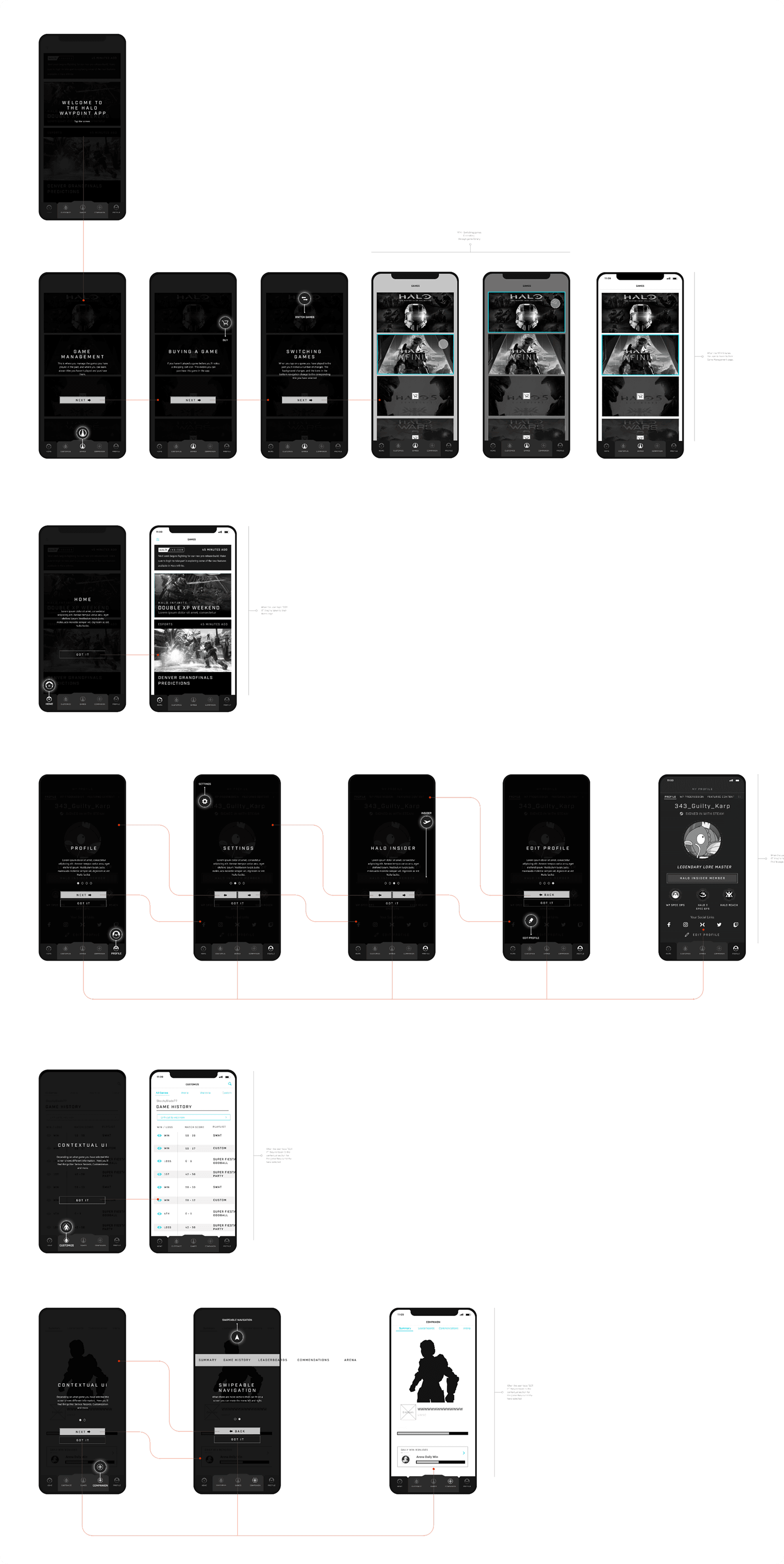
Wireframes Examples
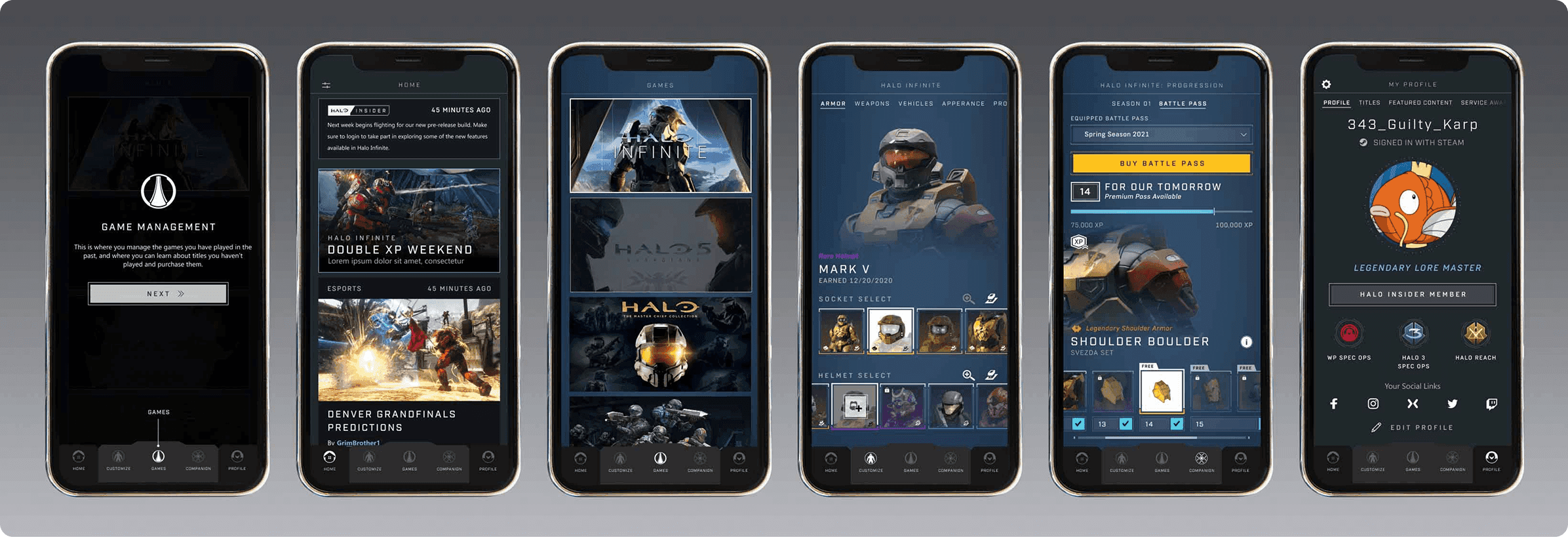
I led wireframing for Halo Waypoint across iOS and Android, covering onboarding, navigation, Service Records, match history, customization, and Infinite-specific flows, all built on a shared system across titles.
Wireframes were presented and reviewed with design, artists, engineering, and PMs as decision checkpoints. We aligned on tradeoffs early and ensured new work integrated cleanly into the broader architecture.
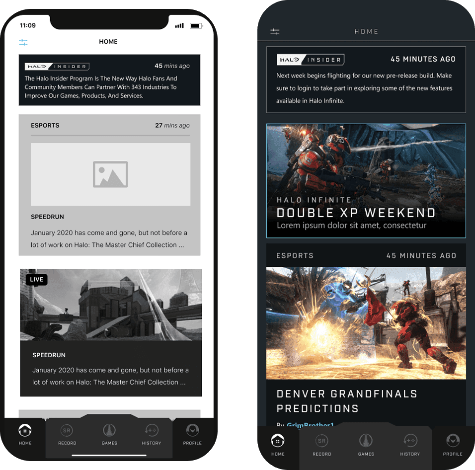
Home / News Feed
A customizable feed for Halo news, updates, esports, and community content, with filters by title and interest.
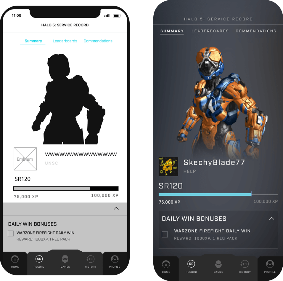
Service Record
Clean, mobile-optimized views for wins, skill ranks, medals, arena stats, and campaign progress. The hierarchy mirrors Infinite’s visual language while supporting legacy data formats.
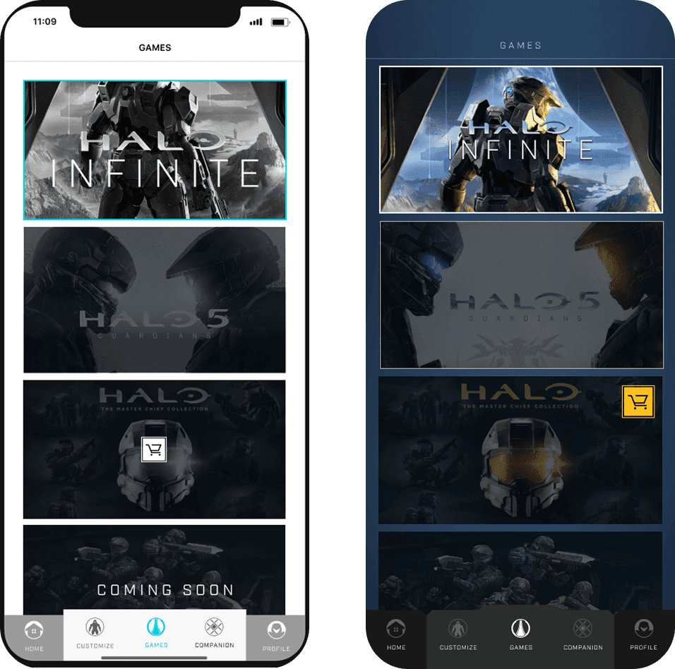
Game Management
Designed a unified title-selection flow with contextual background transitions for each game. I also simplified purchase paths to reduce friction and standardize the experience across titles.
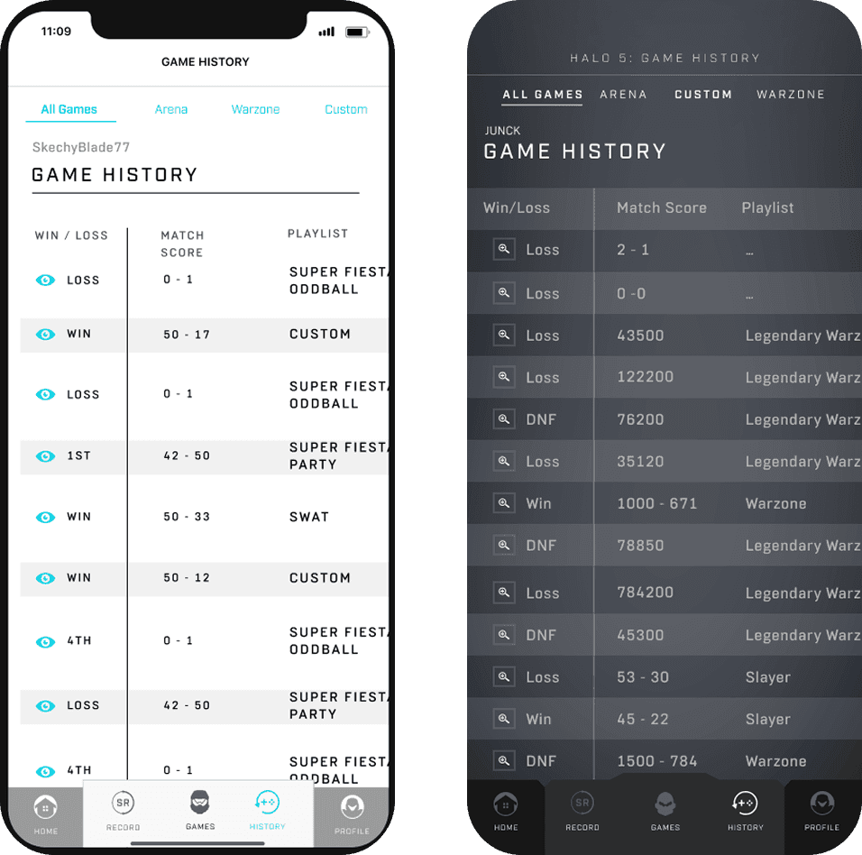
Game History
A session-by-session log that scaled across Infinite, MCC, Halo 5, and Fireteam Raven. The redesigned swipe model replaced static lists and made multi-team sessions easier to explore.
Profile
A streamlined space for account linking, subscription management, badges, and customization assets. This consolidated profile data into a single, mobile-friendly experience.
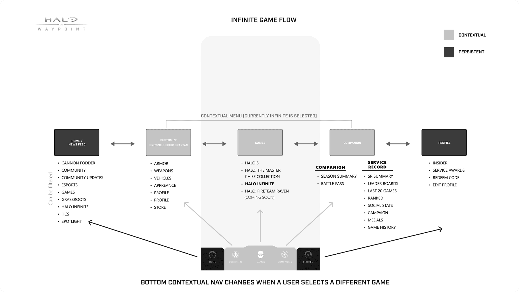
Halo Infinite Specific Persistent Navigation System
For Halo Infinite, I designed game-specific wireframes that extended the shared Waypoint system while introducing a contextual layer unique to Infinite.
The bottom navigation remained persistent, but the contextual menu shifted based on the active title, enabling flows like Spartan customization and Battle Pass progression without disrupting the core structure.

Halo Infinite- Wireframe Examples
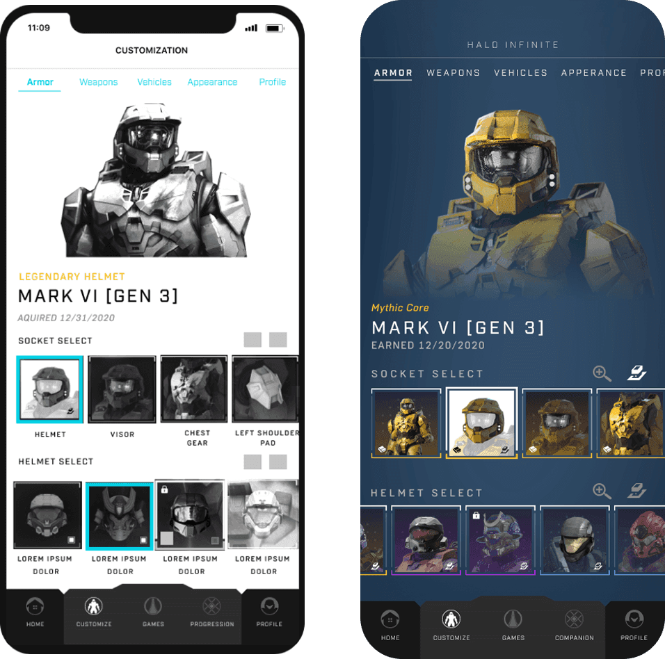
Halo Infinite introduced deeper customization and Battle Pass mechanics than previous titles, requiring expanded mobile support. I designed companion flows that let players manage Spartan customization and progression directly from the app.
Halo Infinite Customization
Designed a mobile-first flow for browsing armor cores, sockets, and items efficiently. The structure mirrored Infinite’s in-game customization while staying aligned with shared Waypoint patterns, keeping loadout management fast on mobile.
Halo Infinite Progression / Battle Pass
Infinite’s progression model introduced Operations and a deeper Battle Pass loop. I designed a companion flow that allowed players to preview rewards, track XP, and move through tiers quickly, preserving in-game parity while optimizing for short mobile sessions.
Key Interaction Pivot After Wireframes
Early wireframes held up in isolation, but testing and prototypes exposed where the system would break. These examples show how I adjusted interaction models after testing.
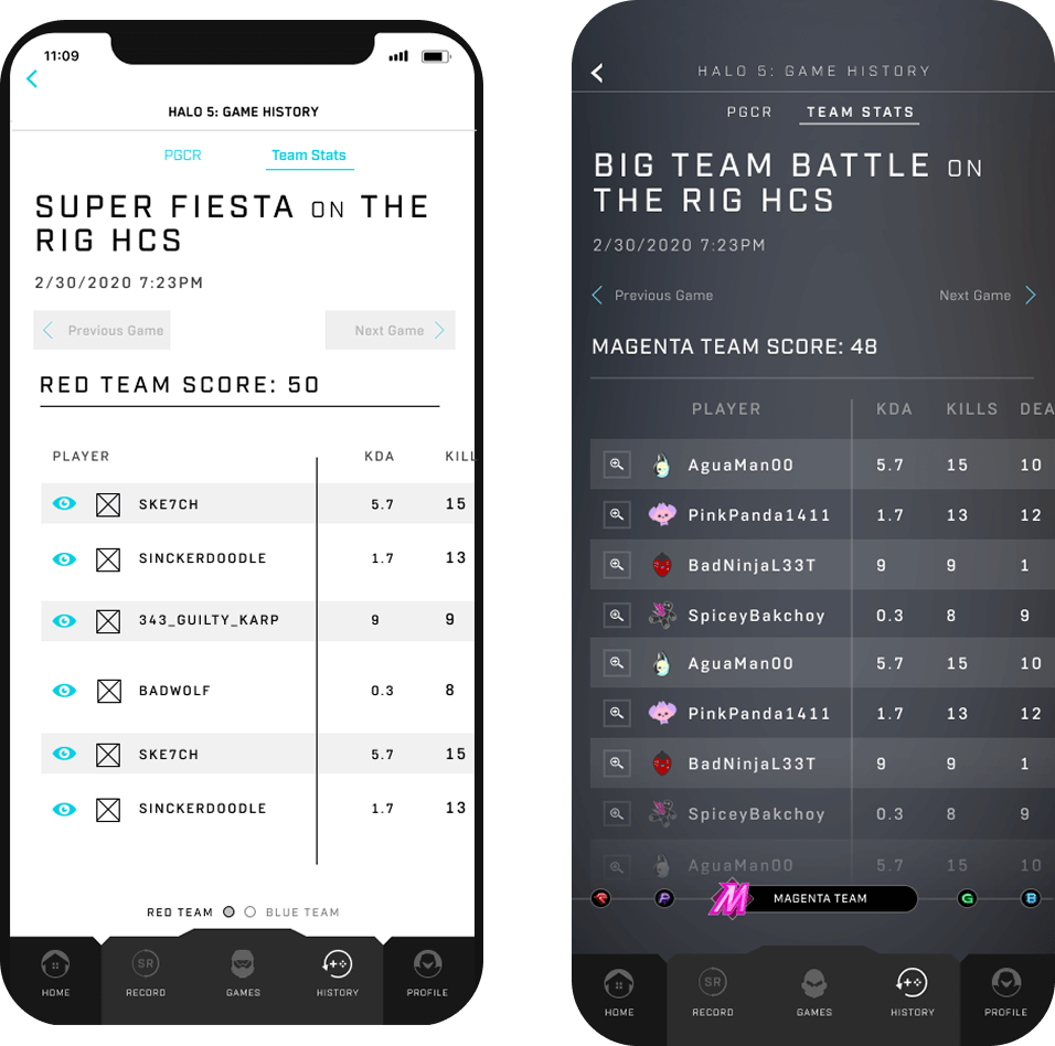
Scalable Match History
Early testing showed my original Halo 5 match history layout didn’t scale beyond two teams. Multi-team sessions quickly became dense and hard to read on mobile.
I redesigned the interaction into a horizontal swipe model, allowing players to move between teams and details without overwhelming the screen. The final pattern scaled cleanly, improved comparison, and became the version shipped to engineering.
Prototype Example
Early prototypes revealed that placing external links directly into the core app created friction and visual noise. Players came to Waypoint to check stats, progression, and customization. Pushing gear, esports, and universe content into the primary navigation disrupted those core tasks.
To solve this, I spent 30 mins and designed a dedicated Transmedia layer that appears only on demand. Tapping Open reveals a focused secondary navigation for Halo Gear, Esports, and universe content. This approach keeps the main experience clean and task-focused, while still giving players structured access to Halo’s broader ecosystem without leaving the app or losing context.
Adding Transmedia Layer to the UI
Testing & Validation
I partnered with the Microsoft Research team to run usability sessions across iOS and Android builds, validating navigation clarity, onboarding, and cross-title flows. Sessions were conducted in person at Xbox Research and synthesized into an expert report that guided final refinements.

After each user test, I reviewed findings with the research team and translated them into design adjustments before UI refinement and engineering handoff. We tested internally with interactive prototypes and new iOS and Android builds, and when timelines allowed, validated changes again with external user groups before launch.
One clear example was the First Time User Experience. Early testing showed the signed-in flow was too linear and text-heavy. I reduced explanatory copy, shifted toward interaction, and streamlined the sequence. The signed-out experience remained stable, but the signed-in flow became lighter and more exploratory in the final shipped version. I was able to reduce the screen flow count from 40 to 19.
The redesigned Waypoint app shipped alongside Halo Infinite and improved how players engaged with Halo on mobile. A unified navigation model reduced cross-title confusion, and streamlined flows made checking stats, browsing history, and customizing Spartans faster.
Infinite-specific features like Customization and Battle Pass progression fit cleanly into the shared structure, allowing players to move between titles without relearning the experience. The app launched with a 4-star App Store rating and saw increased feature exploration during the launch window.
Behind the scenes, we established a repeatable usability workflow with Microsoft Research that reduced UX exceptions across titles and allowed new features to ship without restructuring the core navigation.
Designing Waypoint reinforced the value of system-level thinking. Unifying navigation across Infinite and legacy titles required focusing less on individual screens and more on structure and consistency players could rely on.
The project also formalized a closer partnership with Microsoft Research, embedding usability testing and expert review directly into the workflow. That reduced risk early and supported the product as it scaled.
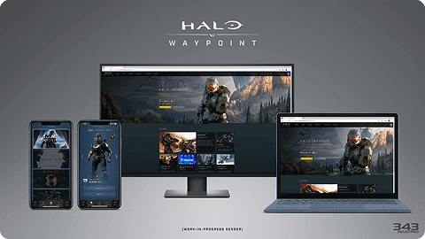
The work was later featured in the Inside Infinite interview series, highlighting the design direction and cross-team collaboration behind Waypoint’s launch.
https://www.halowaypoint.com/en-us/news/inside-infinite-june-2021